Website Redesign:
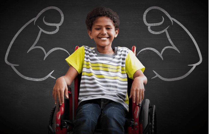
StopAbleism.org
A site about accessibility,
designed with a11y.
1
2
3
4
5
Lesson Learned
Key Insights
Hi-Fidelity Prototype
Brainstorm Solutions
Opportunity
Challenge
Initial Insights
Discovery
Research
Ideation
Prototype
Reflect
UX Process
User Persona
The Why
Hypothesis
UI Style Guide
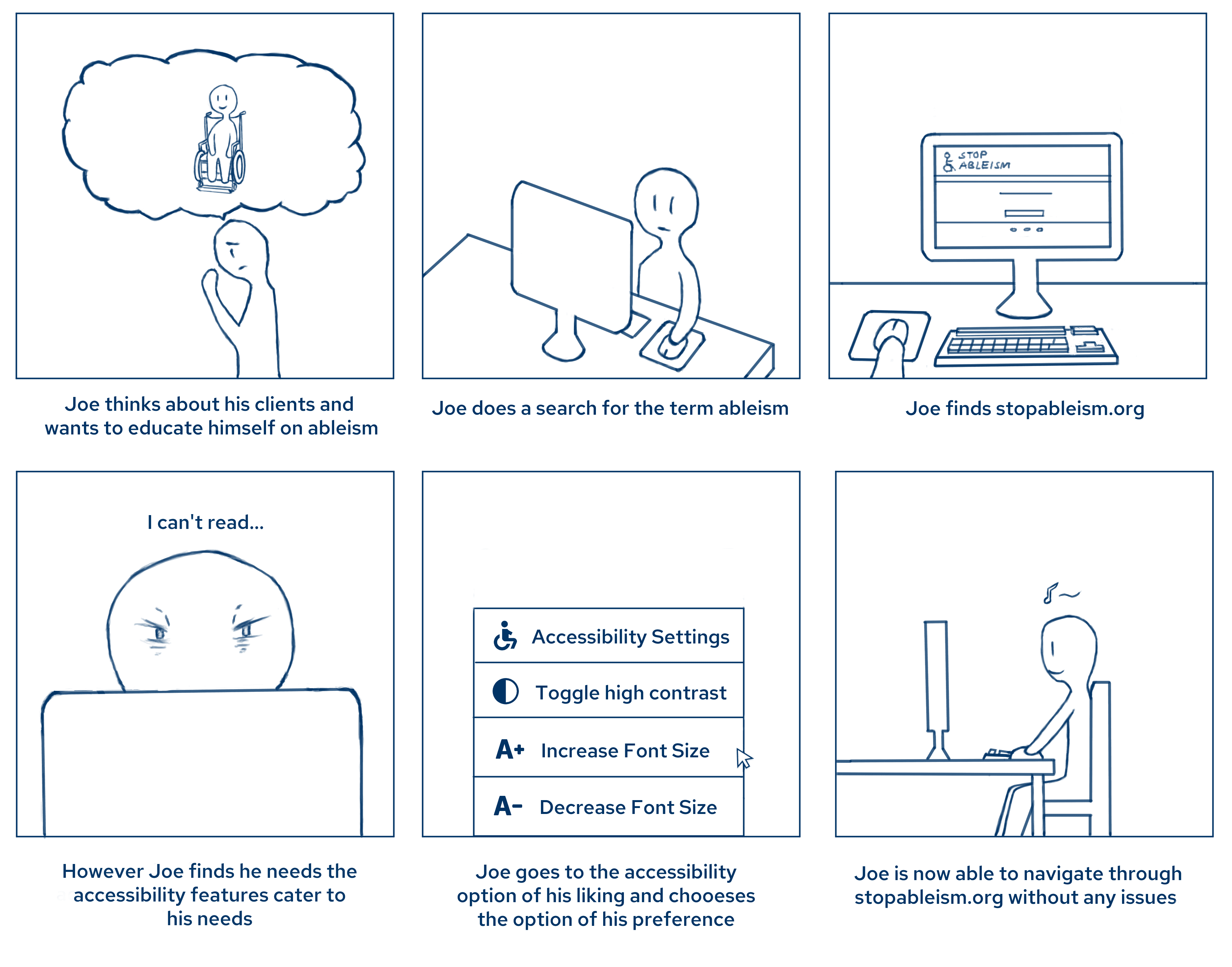
Storyboarding
User Insights
Audits
DISCOVERY
What is a11y?
It stands for "accessibility". It is a numeronym, with 11 being the number of letters between 'A' and 'Y'.
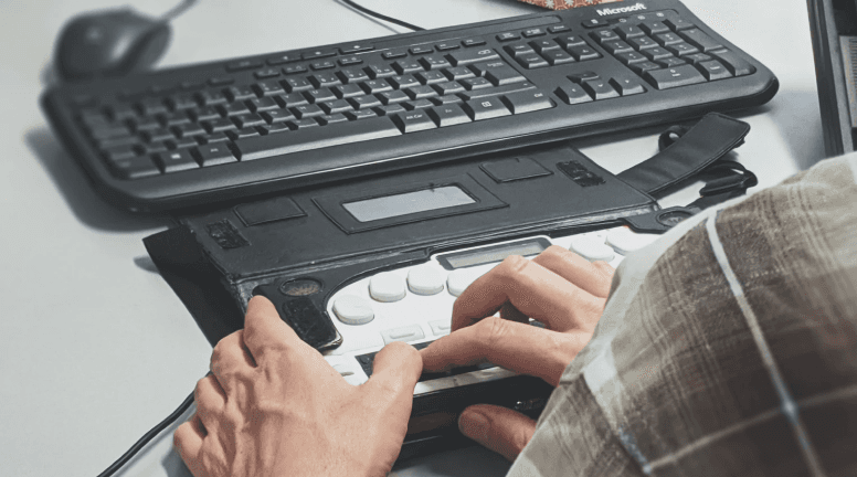
It is the practice of making websites, tools, applications and other technologies that is accessible for all users — including those with a disability.
Initial Insights
During our initial research, we discovered that accessibility (A11Y) is a crucial aspect of user experience design. This led us to investigate organization websites focused on accessibility that, ironically, did not adhere to A11Y guidelines.
Hypothesis
What if we redesign the website to follow A11Y guidelines, ensuring everyone feels included and comfortable navigating it?
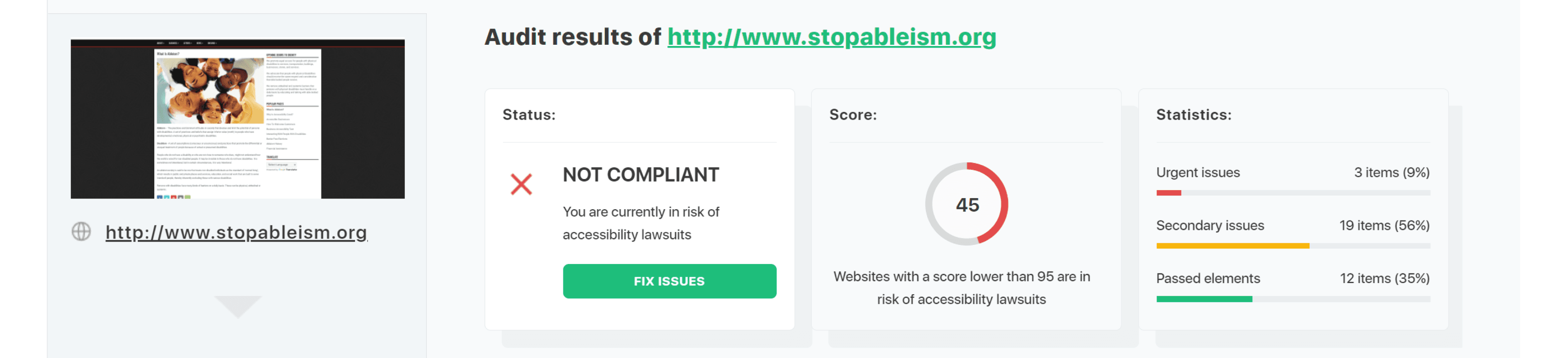
Initial Audits
Understanding the Challenge and Opportunity
RESEARCH
Timeline
June 2022 - July 2022
The Opportunity
Using the checklist from the A11Y project, we can figure out what which part of the A11Y checklist we can incorporate into our redesign first. (
The Challenge
The website we chose to redesign (www.stopableism.org) failed to follow a11y guidelines related to navigation and readability
Tools
Figma
Miro
Slack
Role & Responsibilities
UX Research
UI Prototyping
User Insights
RESEARCH
Empathy Map
RESEARCH
I researched some industry-standard SIEM dashboards from companies like Splunk and Elastic (ELK) in order to decide what analyze the most important features in a dashboard should have.
yes
no
Are you familiar with accessibility?
22 Responses
yes
no
22 Responses
Would you patron a business which is trying to stop an ableist culture?
86.4%
13.6%
22.7%
77.3%
What I Propose…
IDEATION
Creating an environment where admins can customize what they need depending on their preference while having further actionable insights on how to maintain security posture.
Customizable with relevant metrics and data and keeping the interface clean and easy to navigate
Customizable & Minimal Layout
Alerts users and provide actionable steps to empower non-technical users to respond confidently
Guided Actions & Recommendations
"Solution 2"
"Solution 1"
Storyboarding
PROTOTYPE
Lo-Fidelity Prototype
Hi-Fidelity Prototype
typography
Hover State
Brand Logo
Button States
cOLOURS
Normal State
Social Media
Responsive Header Navigation component
Alt Text Images
DROPDOWN MENU
Iconography
Breadcrumbs
ROBOTO / REGULAR / 18px
HEADING
Heading
red hat text / medium / 48px
Heading
TAHOma / regular / 48px
red hat text / Regular / 18px
Paragraph
HEADING
red hat text / MEDIUM / 18px
HEADING
Red hat text / REGULAR / 24px
Heading
Red hat text / REGULAR / 14px
Heading
roboto / italic / 14px
Heading
roboto / medium / 10px
Heading
Red hat text / bold / 24px
Heading
Red hat text / regular / 24px
ABOUT
ABOUT
clicked State
ABOUT


ABOUT
BUSINESS
NEWS
INSIGHTS
RESOURCES
ACCESSIBILITY CONTROLS

ACCESSIBILITY CONTROLS
CONTRAST
FONT INCREASE
FONT DECREASE


ABOUT
BUSINESS
NEWS
INSIGHTS
RESOURCES
ACCESSIBILITY CONTROLS

#FFFFFF
#F2EDDF
#000000
#003365
UI Style Guide
d
UI Style Guide
Hi-Fidelity Prototype
Looking Back…
REFLECT
Key Insights & Wins:
Lesson Learned:
Taking on the entire design process solo taught me the importance of staying organized, adapting quickly, and prioritizing tasks in order to maintain progress.
Since it is a conceptual project, I learned that leveraging AI tools to help with research can boost inspiration and efficiency to streamline my UX process
I learned that designing for non-technical users requires balancing simplicity with functionality which pushed me to think more creatively on how to make a complex system feel more intuitive for everyone.
I took on the challenge of designing all of Canary features on my own, from start to finish. It was a lot to handle but it pushed me to think creatively and stay organized.
Diving into the security market was a new experience, but I quickly figured out where the gaps were and how to address them through design.
I focused on creating a clean and customizable laout that felt intuitive and adaptable while making sure that there are actionable insights and help for admins to be able to navigate.